Introduction
Designing systems for the healthcare sector is much more complex than in other industries, requiring a well-rounded approach that goes beyond standard design concerns. It demands attention to visual and functional elements, a deep understanding of medical workflows and healthcare practices, and adherence to strict regulatory requirements.
To create a functional system for medical professionals, designers must prioritize maximum usability, accessibility, and aesthetics while also navigating legal issues and requirements that could impact implementation or certification.
This post will be especially helpful if you want to:
- Design a healthcare system from scratch
- Create new functionality for an existing system
- Refresh the look of an existing system to improve its usability.
So, if you are in one of these groups, or you are simply interested in the topic of design for the healthcare sector, we invite you to read our post!
Step 0: Legal issues
Before we jump into user research, designing, testing… there is a very important matter – legal issues.
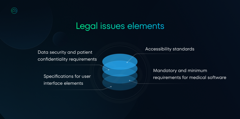
Depending on the country where we release our product, it’s necessary to familiarize ourselves with the appropriate regulations. They typically include:
- Mandatory and minimum requirements for medical software
- Specifications for user interface elements
- Accessibility standards
- Data security and patient confidentiality requirements
- Compliance with industry-specific standards and certifications
- Integration steps requirements with other healthcare systems and e-services
These regulations vary by country and may be defined by specialized organizations.
For example, in Germany, the KBV (Kassenärtzliche Bundesvereinigung) publishes detailed requirements for medical software.
KBV (Kassenärtzliche Bundesvereinigung) is a medical association that functions as mouthpiece for self-employed doctors and psychotherapists around Germany.
At this link you will find the document that specifies and detail the mandatory and minimum requirements for medical software. It indicates what the design should prioritize.
This document contains information about:
- Mandatory fields when displaying information about medications in search results.
- P2-110, 2.2.1: minimum information on finished medications according to the price and product list and other specified sources.
- Design challenge: There is a lot of data, long strings and action buttons that cannot be hidden. Design must present all required data.
- Medication labels that should be represented by icons.
-
- Design challenge: custom and complicated icons or illustrations. Examples:
- “medication withdrawn from the market”
- “medication withdrawn from the market, but available if the pharmacy has stock”
These icons have to be different, but recognizable by doctors.
- Design challenge: custom and complicated icons or illustrations. Examples:
-
- Elements that should always be visible to the doctor, such as patient data.
- Design challenge: Present a large amount of data in a consolidated, clear, and readable manner that fits on screens of various sizes (look at WCAG below).
- Design challenge: Present a large amount of data in a consolidated, clear, and readable manner that fits on screens of various sizes (look at WCAG below).
- Minimal font size – 10pt and specific font family (Monotype Courier or Courier New) for printing preview.
- (P3-720 Allgemeine Vorgaben für die Rezeptbedruckung)
- (P3-720 Allgemeine Vorgaben für die Rezeptbedruckung)
Step 1: Accessibility
The next, very important issue is accessibility. When creating design tools for which medical professionals are the target users, it’s necessary to take into account the needs and potential limitations of the professional group.
Let’s examine a Eurostat study that illustrates the age distribution of medical workers in the European Union:
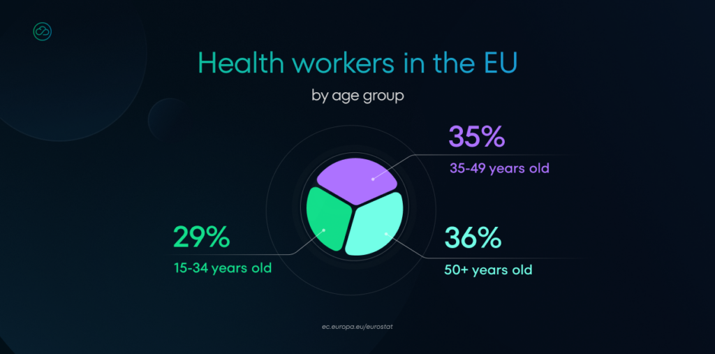
The data reveals that a significant proportion of medical workers are over 50 years old. This demographic insight is crucial for software design as it means our applications will be used by people who may have various health issues or physical limitations.
That’s why we have to consider WCAG.
The Web Content Accessibility Guidelines are a set of internationally recognized standards developed by the World Wide Web Consortium (W3C) to ensure digital content is accessible to all users, including people with disabilities (source).
Below we present some key WCAG recommendations that are particularly relevant in the context of medical software design.
- “The visual presentation of text and images of text has a contrast ratio of at least 7:1”
Note: Given a large number of physicians is relatively older it is essential to keep text easily readable (source). - “Make all functionalities available from a keyboard.”
Note: This is actually very important for the physicians. During our work we discovered that they often use keyboard to navigate, because it’s much quicker for them (source). - “Interruptions can be postponed or suppressed by the user, except interruptions involving an emergency”
Note: During a patient visit, physicians want to do their work very quickly, so notifications that are not accurate with patient visit might be very frustrating (source). - “Confirmed; A mechanism is available for reviewing, confirming, and correcting information before finalizing the submission.”
Note: Finalizing an e-prescription is a critical task where doctors can’t afford mistakes. That’s why we need to allow them to correct errors and provide clear confirmation of their actions (source). - “[…]
- Line height (line spacing) to at least 1.5 times the font size;
- Spacing following paragraphs to at least 2 times the font size;
- Letter spacing (tracking) to at least 0.12 times the font size;
- Word spacing to at least 0.16 times the font size.”
Note: Medical systems often contain a lot of data, labels, and descriptions. It’s important to establish a clear typographic hierarchy to provide readable information (source).
Step 2: Avoid mistakes and burnout
Another crucial consideration in healthcare is the context in which a tool will be used. Medical personnel often use software in stressful situations. Therefore, these tools must provide clear messages and be easy to manage so they don’t interfere with doctor-patient communication.
Apart from WCAG, one of the Nielsen Norman’s heuristics tell us about showing system status (errors, warning, success, info):
“The design should always keep users informed about what is going on, through appropriate feedback within a reasonable amount of time.” – Jako Nielsen
In the medical context, this heuristic takes on even greater significance.
Let’s now examine all the challenges and errors faced by doctors:
- Complex processes and non-ergonomic interfaces can lead to mistakes.
Example presented in this study (link) says:
“[…] For example, when examining blood draw results some interfaces do not group the results under meaningful topics, do not utilize color to highlight abnormal values, or do not clearly display the time associated with the result leading to clinicians making decisions based on information that may be outdated”.
- Doctors may waste valuable time navigating through complicated systems, reducing the time spent with patients.
- Difficulties in quickly accessing patient information or previous treatment records can slow down clinical decision-making which leads to treatment delays
All of these problems lead to increased stress, frustration, and burnout.
Mayo Clinic Proceedings report – “The Association Between Perceived Electronic Health Record Usability and Professional Burnout Among US Physicians” explored the relationship between EHR usability and physician burnout. It found:
- Physicians gave EHRs a System Usability Scale (SUS) score of 45, which is considered “below average” in terms of usability.
- Time-consuming documentation and poor user interface design are significant sources of frustration for doctors, contributing to high burnout rates.
There are more reports like that, which shows us the scale of the problem.
- “Electronic Health Record Usability: Associations with Nurse and Patient Outcomes in Hospitals”, EHR Association (EHRA) 2021
- “Comparing International Experiences With Electronic Health Records Among Emergency Medicine Physicians in the United States and Norway: Semistructured Interview Study”.
Addressing usability issues in medical software is crucial as it directly impacts patient care and safety.
Step 3: Implementing User-Centered Design
By focusing on user-centered design, we can address many of the usability issues, ultimately improving efficiency, reducing errors.
It’s important because, at the end of the day, it’s the doctor who sits in front of their computer and inputs a multitude of important data that has enormous significance for patients’ lives and health. There’s no room for fatigue, mistakes, or any ambiguities here.
User-centered design (UCD) is an iterative design process in which designers focus on the users and their needs in each phase of the design process.
In UCD, design teams involve users throughout the design process via a variety of research and design techniques, to create highly usable and accessible products for them (source).
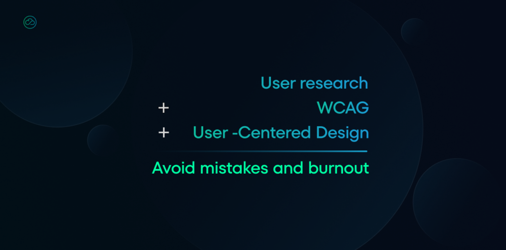
That means that before implementing anything, we should study how our user (the doctor) behaves. This is where User research comes to the rescue:
User research involves collecting and analyzing data about users through various methods such as surveys, interviews, and usability testing. This allows us to reach user’s (doctor’s) pain points and spot the opportunities, not only to fix usability issues, but also to improve workflow.
We can ask our doctors about:
- What does the communication in facility look like? Maybe they struggle with effective and safe communication with each other?
- What their workflows look like, what are typical activities during the day.
- How they collect information, not only in digital form. Doctors often write down information on paper, so it’s worth looking closer at this.
- Where in their work the most errors occur, where they struggle.
- How they interact with existing systems and tools.
(these are only some examples, during discovery phase we should ask many more specific questions)
What methods can we use?
- Face-to-face and remote user interviews
- User testing
- Examination of existing data
- Observations in work field
Talking to our users (doctors) is the only way to confirm that our software improves their daily work. We can test our solution in the beginning of the project – on discovery phase, during project and after implementation.
If you want to explore this topic further, this study: Electronic Health Records and Improved Patient Care: Opportunities for Applied Psychology addresses the need for understanding of cognitive or perceptual needs of the clinician.
Step: … AI
What about the future where AI is helping doctors in their everyday work?
User-centered design might be the bridge between technology and users. Design’s job is to present AI’s work in a clear, trustworthy manner.
Design should anticipate and highlight what has been done by AI, show alternatives, and catch common errors caused by human oversight.
A study at Sentara and UC San Diego Health highlighted the importance of transparency in AI tools used in healthcare. The research emphasized that doctors should actively engage with AI-driven decision-making processes, understanding both the data inputs and the reasoning behind AI conclusions.
AI won’t replace doctors but rather assist them during their long shifts in clinics.
If you’re interested in AI in healthcare or developing software from a technological perspective, we invite you to explore more articles on our blog and LinkedIn. Feel free to contact us with any questions about building software for the healthcare industry.
Who are we?
At NubiSoft, we develop software for the healthcare industry. We are a trusted technology partner for medical institutions as well as for companies whose end users are medical professionals.
We are certain that well-designed solutions can make a real difference in the work of medical professionals.
We are ready to help your company join the AI revolution safely and sustainably. Contact us when you think you’re ready for it, too.
